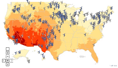
Solar power in the US: Dark red = highest potential. Pale yellow = lowest potential
By James Dacey
At the end of last week, Hamish drew attention to David MacKay – a UK physicist who is on something of a crusade to take the “hot air” out of the sustainable energy. Mackay’s approach is to explain the potential of each renewable technology option in everyday numerical concepts.
This week, in the US, a collaboration between Google Earth and the Natural Resources Defense Council (NRDC) is attempting to bring the same simplicity to the visual representation of renewable energy options.
They have launched an online interactive map of the US showing the best (and worst) regions to generate energy from the sun, wind, biomass from wood and crop waste, and biogas from animal waste at livestock and poultry farms.
“This new tool is designed to help regular people from farmers to politicians, financiers to reporters understand that renewables are here now and posed to become major players in our energy mix,” said Nathanael Greene, NRDC’s Director of Renewable Energy Policy.
Whether or not this map does have a big impact on professional stakeholders remains to be seen. Personally, I think the more important thing about the maps is their visual impact… as somebody commented on the associated blog:
“It makes a clean-energy future seem imminent, and eminently do-able”
From just glancing at the maps one thing that becomes quickly apparent is the reliance that the East may come to have on the sparsely-populated regions of the West where important sources like solar, wind and geothermal power have far more potential.


