Map of physics in 1997…
By Michael Banks
Producing maps of science seem to be a popular pastime for researchers these days.
Only last month we reported a map made by using over a billion so-called “click-throughs” – produced when going from a web portal like Elseiver’s Science Direct to the full text of a paper or to the abstract on the journal’s website.
Now physicists have made a map using the Physics and Astronomy Classification Scheme (PACS) codes produced by the American Institute of Physics (AIP).
PACS codes contain four numbers and two letters, which are used to classify papers according to the research they contain. Each paper usually includes two or three PACS numbers listed just after the abstract.
The first two numbers of a PACS code denote the subject area, which are grouped in tens. For example, 20-29 is nuclear physics and 30-39 is atomic and molecular physics while 60-69 is condensed matter: structure, mechanical and thermal properties.
Then within nuclear physics, say, there are up to 10 subfields such as nuclear structure (21) and nuclear astrophysics (26). These subfields are also split in tens, so nuclear structure runs from 21.10 (properties of nuclei; nuclear energy levels) to 21.90 (other topics in nuclear structure).
Bear with me a little longer, nearly there. Next is where the letters come in. Within, say, 21.10 there are then a list of topics, such as 21.10.Tg (lifetimes, widths) or 21.10.Dr (binding energies and masses).
Taking papers from the last two decades in the AIP’s database, Mark Herrera from the University of Maryland, David Roberts from Los Alamos National Laboratory and Natali Gulbachce from the Northeastern University in Boston, have created a map using the links between different PACS numbers.
For example, when a paper quotes two PACS codes, these topics are then linked. Running all this data through an algorithm then sorts and finds clusters of nodes and groups them.
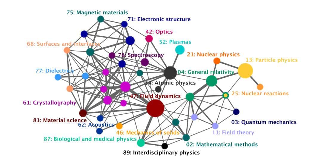
The above images show the full maps from 1997 and 2006 with subfields of a subject area shown (that is the first two numbers in a PACS code). The nodes represent the subject area, and its size is proportional to the amount of single PACS codes it contains. The thickness of the links indicates how many papers have PACS codes corresponding to both nodes.
According to the researchers, the map lets you see how areas shrink and grow and how they merge with one another.
For example, in 1997 crystallography (61) was one central node, but in 2006 it had split into five (as deduced by the algorithm). Even though each one is strongly linked with the others, the algorithm didn’t deem it one single node, which may indicate five separate fields emerging within this area.


