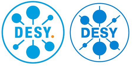
We have noticed that the DESY lab in Hamburg has had a rebrand that involves a change to its logo. At first glance, however, it might not be obvious what those tweaks are.
On closer inspection, you will just make out the addition of a small orange dot after DESY while the lines that go through the six balls now stop rather than sticking out at the other end (and are slightly thicker).
So why did the lab feel the changes were necessary? “The new logo is a way of expressing and keeping up with the momentum of our research centre [and] we think [the new logo] is clearer and more dynamic,” a DESY spokesperson told Physics World. “The new orange dot represents the undiscovered, the unknown. If you see it as a punctuation mark it also turns the logo – and with it DESY as a whole – into a statement.”
Physics logos
Given that the orange dot has such a deep meaning, do the six blue balls represent anything in particular? “They are completely up to the interpretation of the beholder, so no matter whether you see a simplified model of an atom, the six quarks, lollipops, dumbbells or a particle collision it’s all correct,” adds the spokesperson.
I will stick with lollipops then.


