Labs, societies and funding agencies all have logos of one sort or another, but what – if anything – unifies them? Robert P Crease investigates

A recent controversy in the US about whether the Confederate flag should be displayed in public places has ignited a furious discussion about the meaning and purpose of symbols. The flag in question is one variant of several emblems of the Confederate states whose secession from the Union ignited the American Civil War. How is it possible for a logo whose elements are so simple – white stars inside a blue St Andrews Cross against a red background – to have such a variety of meanings?
Logos are everywhere, and a quick Internet image search turns up physics logos of all sorts. But what is their meaning and purpose? What aspects of physics do they promote? What is their value?
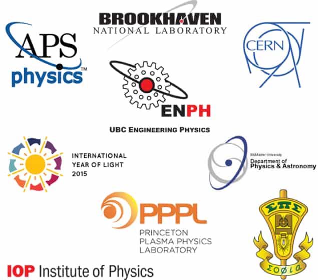
Many physics logos are simple and rather predictable, using a dot on a sweeping line to suggest an orb and orbit, either a particle or planet. These include the logos of the Brookhaven National Laboratory and the American Physical Society.
Other logos exploit the particle–planet ambiguity more imaginatively to incorporate aspects of physics or specific fields of research. The logo of physics and astronomy department at McMaster University in Canada, for example, also neatly suggests a specific planet, Saturn, while its yin-yang image invokes the complementarity of physics and astronomy.
Several physics logos suggest explosions or particle collisions, resembling a chandelier of the style that designers and architects call “mid-century modern”. A few logos manage to suggest both the microscopic and macroscopic nature of physics, such as one used by the engineering-physics programme at the University of British Columbia, which shows an orbit around a gear.
The Princeton Plasma Physics Laboratory has a modern, stylized logo. The graphic is ambiguous, and suggests an eye or a vortex of whirling plasma currents. It’s pleasing to look at and represents something relevant to physics.
Still other logos call attention to some specific and recognizable structural element instrument of the organization or the subject. The CERN particle-physics lab’s classic logo, which has a lot of lines but is nevertheless graphically simple, suggests an accelerator and manages to look almost 3D. The logo of the International Year of Light (IYL) communicates what it stands for, but almost too explicitly, with an image of the Sun surrounded by array of flags bearing colours of the spectrum.
The Sigma Pi Sigma (ΣΠΣ) society, which honours “outstanding scholarship in physics”, has an ambitious logo whose meaning is more opaque to outsiders than most – and surely even to many students, for the elements refer to century-old instruments. The overall shape of the logo resembles a voltmeter, which is “a symbol of the accuracy necessary for an experimental science”, according to a ΣΠΣ webpage, while the dynamo powering the light bulb inside “represents the creative energy needed to produce the illumination of knowledge”.
At the other extreme is that of the Institute of Physics, which publishes Physics World. It lacks any physics-related elements, confidently using a simple trio of only three sans-serif bold letters to suggest that the organization is distinguished enough not to need any representations.
The critical point
The logos I came across promote a variety of physics aspects: microworld and macroworld, theory and experiment, research and instrumentation. Still, I expected to find a wider range of elements used. Why aren’t there more pendulums, for instance, given that it’s a physics tool that has been in continuous service for over four centuries? Do so few measuring instruments turn up in physics logos because the simplest to represent – a pan and scale – has been co-opted by justice? Why aren’t there more logos incorporating light?
“Have a design contest” is rule number one of a website called “How not to design a logo”, which makes me reluctant to ask for new designs.
I am, though, interested to discover clever examples that I may have overlooked. Send them to me and say why you think they are interesting from a design and a physics perspective, and I’ll write about the results in a future column.
In fact, is it possible to encapsulate what physics is about in a single logo? Or does physics have so many meanings that this is impossible?


