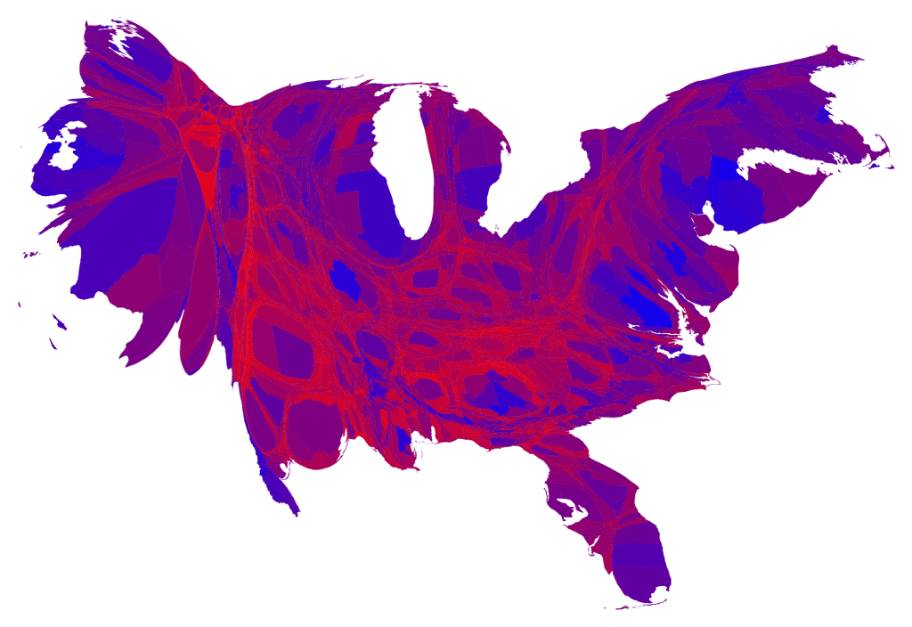
Cartogram of 2012 US presidential election results. (Courtesy: Mark Newman)
By James Dacey
In the world of political punditry, the US election results are usually represented by a map of the nation with each of the 50 states coloured either blue for a Democrat victory or red for a Republican victory. The resulting map – this year, at least – can appear at odds with the overall election result, as large swathes of the sparsely populated centre were Republican red, whereas the geographically smaller but densely populated west coast and north-east regions were Democrat blue.
A more nuanced view has been offered up by Mark Newman, a physicist at the Center for the Study of Complex Systems at the University of Michigan. In this cartogram he has broken down the regions into counties rather than states, and the shade of purple represents the balance between Republican and Democrat. The size of individual counties is proportional to its population, and subsequently its influence on the “electoral college” vote, which ultimately determines the outcome of the election.
You can see several other visualizations of the election result on Newman’s web page.