Once upon a time the illustrations in physics and astronomy papers were mostly line diagrams, plus the occasional black and white photograph, but advances in imaging technology and computer power mean that some results now resemble works of art. Here we examine three images that have been so widely used on the covers of books and magazines – and on posters, calendars, mouse-mats and elsewhere – that they qualify for some sort of iconic status
Eagle Nebula
This image of Eagle Nebula has appeared on numerous magazine covers and posters, and was one of four images chosen for a special set of US stamps to mark the 10th anniversary of the Hubble Space Telescope. The enormous popular appeal of this image of the Eagle Nebula was highlighted recently when the readers of Sky and Telescope magazine voted it the second “most influential astrophoto of the 20th century” – beaten only by the famous “Earthrise” photograph taken during the Apollo 8 lunar mission. The Eagle Nebula image has also appeared on numerous magazine covers and posters, and was one of four images chosen for a special set of US stamps to mark the 10th anniversary of the Hubble Space Telescope. “We knew when we took the picture that it was a corker,” says Paul Scowen of Arizona State University, who obtained the image with colleague Jeff Hester in 1995. “However, the degree to which it became so popular was surprising.”
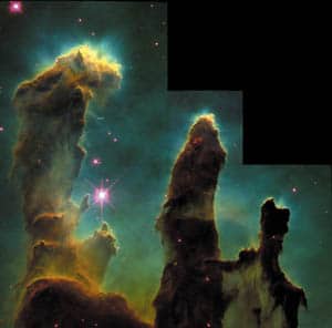
The Eagle Nebula (M16) is a large star-formation complex in the constellation Serpens, some 7000 light-years from Earth, and the image shows evaporating gaseous globules emerging from pillars of molecular hydrogen gas and dust. The giant pillars – which are 11 trillion miles high – are so dense that the gas inside them contracts gravitationally to form stars. The intense radiation from the bright young stars causes low-density material to boil away at the end of each pillar, exposing the globules (J J Hester et al. 1996 Astronomical Journal 111 2349).
The unusual shape of the image was dictated by the field of view of the WFPC-2 camera on the Hubble telescope. “The three columns are of different lengths and to get them in the picture, the camera and the observatory had to oriented just so to make it work,” recalls Scowen. Hester and Scowen also combined images taken with filters at three different wavelengths to create the final image. For instance, the blue areas in the image are very hot and rich in doubly ionized oxygen atoms, whereas the red areas are quite cool in comparison and rich in singly ionized sulphur.
Scowen points out that the photograph is a false-colour image and that the Eagle nebula would actually look mostly green if we could see it. “This is because the human eye is most sensitive in the mid-green area,” he explains, “and that is where the oxygen emission is strongest.” Although the false colours are undoubtedly eye-catching, Scowen stresses that they are chosen for scientific reasons rather than principles of realism or aesthetics. For instance, hydrogen is coloured green in the image, even though it is really red, because sulphur is also red and astronomers need some way of telling them apart.
The widespread visibility of stunning images like that of the Eagle Nebula is one of the reasons for the popularity of astronomy with the general public. “We are working with some of the most gorgeous images humankind has ever seen,” says Scowen. However, he is also keen to convey the science behind the photograph. “I have given enough talks to the public to have a pretty good feel for what works and what doesn’t,” he says, “but I always try to highlight the scientific value of the images as well, so that the public sees more than the simple ‘gee whiz’ factor.” Indeed, some astronomers have recently questioned if evaporating gaseous globules play a major role in star formation – still one of the least understood processes in astrophysics – but there can be little doubt about the lasting impact of this image.
Entangled photons
Entanglement is one of the most puzzling phenomena in quantum mechanics, and also one of the most difficult to illustrate, which could help explain why this image of entangled photons has proved so popular. The photograph was created by Paul Kwiat and Michael Reck at the University of Innsbruck in Austria in 1995.
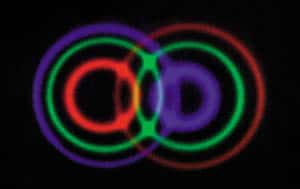
To produce the entangled photons, the Innsbruck team shone an ultraviolet laser beam at a crystal of beta barium borate. About one in ten billion of the photons were “down-converted” into two lower-energy photons, which were emitted on opposite sides of the ultraviolet beam along two cones. The photons on one cone were vertically polarized, while those on the other were horizontally polarized. Under certain conditions, the polarizations of the photons were entangled – in other words the correlations between them were stronger than any correlations allowed by classical physics.
The photograph is unusual in that it was obtained without a lens, with the down-converted light from the crystal falling straight onto the photographic film. The image shown is actually a false-colour composite of three images – each requiring a 40 minute exposure – taken with different filters in front of the film: the blue rings correspond to light with a wavelength of 681 nm, green is 702 nm and red is 725 nm. Entanglement was observed for 702 nm photons travelling in directions that correspond to where the green circles overlap (P G Kwiat et al. 1995 Phys. Rev. Lett. 75 4337). About 1 in 500 of the down-converted photon pairs are entangled, which means that fewer than 1 in 1012 of the original ultraviolet photons result in entangled photons.
The long exposure time meant that Kwiat and Reck had to keep any stray light awat from the film. The photographic company the researchers used also managed to ruin the first roll of film and Kwiat and Reck had to repeat everything again. However, the firm is acknowledged in the original paper for developing the second roll at night to ensure optimum conditions.
According to Kwiat, who is now at the University of Illinois at Urbana-Champaign, he and Reck did not pay particular attention to the aesthetic appearance of the image, although they wanted the colours to be easily distinguishable. They also deliberately chose red for the longest wavelength photons and blue for the shortest. Any other aesthetic considerations were purely subconscious, says Kwiat: “We weren’t particularly thinking ‘Ha! Now this would look good on wallpaper’.”
Kwiat is interested in the interplay between physics and art, but he admits that the two communities often have different ideas about beauty: “There’s nothing like seeing a good sine wave on your oscilloscope at 2.00 a.m. when you’ve been searching for it for months and months – it’s really beautiful.” He also sees many similarities in the way that physicists and artists work. “Artists often look at the same object from many different perspectives – from different angles and using different media to represent them,” he says. “Physicists do the same, whether we’re solving something using Maxwell’s equations or quantum mechanics or quantum electrodynamics, working in different co-ordinate systems and so on.”
There are further similarities between artists and scientists, according to Kwiat: “The other thing that artists do – not just for physicists but for everyone – is to have a real appreciation of beauty in the world and in nature, and how we interact with that. I think that it’s important for everyone to maintain this. It is even more important for scientists, so that we don’t become too abstracted away from the fact that what we really are is natural philosophers – we’re trying to understand nature, to unravel the mysteries of the universe as it were.”
Quantum mirage
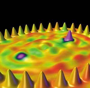
Since it first appeared on the cover of Nature in February 2000, the “quantum mirage” has featured on posters, calendars, websites and the covers of various books and magazines. The image – which was obtained using a scanning tunnelling microscope – shows the electronic wavefunctions inside an elliptical “quantum corral” made of cobalt atoms on a copper surface. It was created by Hari Manoharan, Christopher Lutz and Don Eigler of the IBM Almaden Research Center in California.
Eigler has a track record of producing iconic images. In 1990, working with Erhard Schweizer, he spelt out the letters “IBM” using 35 xenon atoms. And three years later, working with Lutz and Michael Crommie, he released the first images of the “quantum corral”, which have also been reproduced in numerous places. However, Eigler admits that he has been surprised by the widespread popularity of the quantum mirage. “I don’t have much of a feel for what excites and interests other people,” he told Physics World. “I did not think that the image of the quantum mirage would be of broad interest.”
To create the image Manoharan, Lutz and Eigler first used a scanning tunnelling microscope (STM) to position 36 cobalt atoms in an elliptical ring (the orange peaks), and then placed another cobalt atom at one of the two focal points of the ring. Next they used the STM to measure the Kondo effect (the purple peak) caused by the magnetic properties of the lone cobalt atom (2000 Nature 403 512). They also detected a much weaker Kondo effect at the other focal point (the purple patch on the left), even though it did not contain a cobalt atom – hence the name “quantum mirage”.
Hari Manoharan, who is now at Stanford University, chose the colours for the image, which is actually constructed from two data sets. The first set contains topographic data and the second the magnetic information. “Both data sets share the same x-y co-ordinates,” he says, “so the challenge was to illustrate a 4D data set in a 3D surface.” Manoharan represented the topographic data as height and the magnetic information (i.e. the Kondo effect) as colour, so the peaks in the image show where the atoms are located, while the colours represent the magnetic data, with purple corresponding to the strongest Kondo effect and green to the weakest.
Eigler, who is married to an artist, confesses that he does not like the colour scheme. “But,” he adds, “there’s no accounting for taste – my taste, Hari’s taste or the public’s – is there?” However, he says that he is “vitally interested” in the interaction between physics, aesthetics and art. This applies to his work and to his hobby – restoring and customizing cars. “Usually I pull art into my physics world, either in how I handle an image, or in the appreciation or design of some laboratory gizmo. I also apply my skills as a physicist – design, fabrication, electronics, welding – in my car restoration/customization pursuits.”
So does Eigler think that physicists have anything to offer artists, or vice versa? “I am sure of it,” he says, “but I am also sure that it is serendipitous.” He also paints a vivid picture of the parallels between art and science: “long hours, commitment, passion, beauty, style, cliques, superstars and unknowns. But the most important one, I think, is the spark of creativity.”